Vibes > Numbers. Wait, what?
Hello, friends — welcome to Analytics Week. For five of our 100 Days to Kickoff, FTRS is bringing you college football analytics content, powered by our friends at cfbfastR and Statsbomb.
But why? Why are we writing about analytics? Why are football analytics so in vogue? Why are numbers clouding our beautiful game? Why won’t these kids get off my lawn? Well, I’ll tell you, random strawman debater I’ve invented — in the form of a short exercise. Here’s a typical anti-analytics straw-man argument that you might hear from a head coach:
Why would I rely on analytics to tell me what to do? I’ve been coaching 30-some-odd years. I’ve seen everything. My gut and my eyes are going to tell me the best thing to do. I don’t need to listen to what a computer spits out for that.
Ok, fake head coach, let me spin you this riddle: what if we take the word “analytics” out of the equation? As a term, it’s overloaded — a true buzzword — effectively meaningless given its generality. What if we replaced it with film?
Why would I rely on film to tell me what to do? I’ve been coaching 30-some-odd years. I’ve seen everything. My gut and my eyes are going to tell me the best thing to do. I don’t need to listen to what a computer spits out for that.
Now, that sounds a little ridiculous, doesn’t it? Coaches would never eschew film study just to go with their gut — by nature, they want more information. Put a different way:
Much like our fake head coach, we all have some learned knowledge of the game from our experience — individually, we’ve each watched enough games to establish some concept of “this is how things are meant to be”. If I watch one game in each East Coast TV slot every Saturday (noon, 3:30pm, 7pm, 10pm), I’m taking in four games a week. Across a standard regular season (13 weeks before conference championships and bowl games), that’s 52 games. Across ten years of watching games regularly, that’s 520 total regular-season games. That’s a lot of games! But in those same 10 years, there have been 6978 actual FBS vs FBS regular season games. My lived experience counts for only 7.5% of those. While I might think I know something, my lived sample size that I have picked that up from is actually fairly small — it’s entirely possible that another person has watched an entirely different set of 520 games and has learned something entirely opposite to what I think I know.
So what if we could watch every game? Would our truisms about sport — the things we think we know — be proven out? What really helps teams win? What else could we learn?
This series is meant to drive interest in that search for deeper insight. If our work can lower the barrier to entry in a meaningful way so others can understand the game better or learn something new, I’m all for it.
With all of that in mind, let’s start with the concept of Expected Points. Why pinpoint this particular concept to start the week? Three reasons:
- Expected points added (EPA) is one of the most well-known football advanced stats — if you come into contact from anything from the CFB advanced stats world, it’s going to be EPA.
- It’s also one of the easiest to understand from basic principles (as you’ll see below).
- If our end goal with the wide world of “analytics” is to figure out what helps teams win games, then it makes sense to look at the relationships between specific stats and wins. In a variety of studies (using a variety of methods to slice and dice it), expected points has been found to be highly correlated with wins.
We actually covered the philosophy behind this concept in a previous iteration of this series and the cfbfastR site covers its rich history, but let’s take a different tack here.
Imagine two plays in tied games side-by-side. On the left, the offense is at their opponent’s 25. On the right, the offense is at their own 25. What do you see? When you step into either stadium, what do you feel?
Well, in Left Stadium: there’s palpable anticipation in the crowd. The offense is right there — one good play and they’ve got six more points! But over at Right Field, the crowd is nonplussed; fans know they’ve got some work to do to get down the field.
Let’s add another layer to those plays: in Left Stadium, the offense has a fourth-and-one at the opposing 25. In Right Field, the offense has a first-and-ten at their own 25.
The fans in Right Field are still unaffected. Some of them have left their seats to go hit the concession stands. There’s just a low din in the stadium — the buzz of activity and casual conversation as the offense gets going.
By contrast, Left Stadium is on edge. The offense’s fans know this is a critical moment in the game and can barely breathe, but the defense’s fans have pulled out every chirp in the book to throw the quarterback off his game.
Let’s add a third layer: the game in Right Field has just kicked off with a touchback — most fans aren’t even in their seats yet and are still milling about the concourse. But in Left Stadium, there are only 20 seconds left in the fourth. Fans of the defense have long since lost their voices but persist emptying their lungs in an informal collective prayer, urging their team to stand strong in the face of imminent doom.
The examples we’ve built are quite extreme, but each layer we added to Left Stadium and Right Field added (or removed!) a palpable level of tension — why? We know the game is tied, and given the games we’ve watched before, we know that each layer affects the chances of the offense scoring within the current drive (and in Left Stadium, within the confines of the game). In one case, that means winning the game; in the other, that means just getting the day started.
Thus, we know the facts of each situation — yard-line, down/distance, and time remaining — and we’ve established some way to understand the tension of a given situation: the chance of points soon. Congratulations, we’ve just designed an expected points model.
Wait, what?
Yes, yes we have! Think back to our examples: in different situations, we feel different ways based on if we think someone is going to score soon. The concept of expected points is just a method of quantifying that feeling. We’re using advanced math to get there, but the underlying concept is really just vibes, yo.
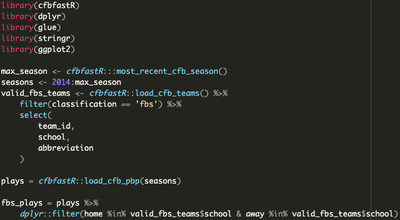
With the hard feelings out of the way, let’s get back to the comfortable world of black/white computerized mathematics. Let’s borrow from our leading example — watching every FBS vs FBS game that’s been played since 2014 — and set up our initial dataset, collecting literally every play from every one of those games.
Before we get to any complex math, we need to solve one challenge: how do we define the chance of someone scoring soon?
“Wait, isn’t that the whole point of this exercise? You’re making me figure out the critical part of this? Aren’t you supposed to be teaching me?”
Yes, yes, and yes! But all in good time. Take a couple minutes to think about this — I’ll wait.
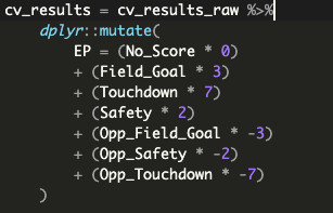
Let’s take a step back and think about what constitutes scoring: at a given moment, one team can produce the next score in the half by scoring a touchdown (six points), kicking a field goal (three points), or generating a safety (2 points). But that goes for both teams, right? When one team is on offense and they produce the next score, that is a positive outcome — but if the other team produces the next score, that’s a negative outcome for our first team. Put a different way: an opponent can score a touchdown (either by their defense or by their offense on the next drive) and effectively produce -6 points for the current offense, the opposing offense can score a field goal (-3 points) on the next drive, OR the defense can net a safety (-2 points).
Thus, there are six possible ways to generate the next score. We also have to keep in mind the chance that neither team could score next before the end of the half, which makes for seven possible outcomes for the next score. Given that we know how each game ended, we can annotate each play with what the next score was.
There’s two other final pieces of information we might want to add to our model: firstly, timeouts. Including timeouts as a factor makes sense — they stop the clock, affecting how much time remains in the half. If you can control when the clock stops (IE: you have timeouts), you can control how much time remains in the half, which means there’s more time for you to try to score next. In the model, we can simply use the number of timeouts the offense and defense have remaining to quantify this effect.
The final piece to our puzzle is home-field advantage: we know that home teams have a number of structural advantages (no travel, crowd influence on referee decisions, etc) and incentives (winning in front of students you’ll see in class, playing well to induce alumni donations, etc.) to score more points and (therefore) win more games, and as such, they win ~58% of the time across the ~7000 games in our dataset. Indicating if the offense in a given play is the home team captures this effect in our model.
We’ve now established our inputs in full: down, distance, seconds remaining in half, yard-line, timeouts for each team, and home-field advantage. The output is the chance of the offense scoring. But while there are seven possible options for the next score in the half, we can only have one output variable. How do we get around this?
Oddly enough, the answer is in how we’ll generate predictions using the model. The modeling technique we’ll be using provides “class probabilities”, so if we define our “next score in half” column a certain way, we can pass each of the seven options as a “class”, and the model will give us the probability that each of those options could happen.
Enough talking about our model; let’s train it! But wait, what does this mean?
Let’s go back to our framing: it’s impossible for you or me to watch every game, but what if someone could? In this case, that someone is a computer — instead of being limited to a sample of ~520 games of “lived experience”, the computer can imbibe all ~7000 games and “learn” something. By providing a set of inputs and an output, we can focus that learning process, encouraging the computer to learn a specific “thing”. Here’s what that looks like in code:
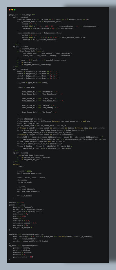
After some light cleaning (we don’t want our model to “learn” from plays with invalid timestamps, invalid next-score-in-half values, or from penalties), our model has been successfully trained with ~1.2 million plays across ten years of FBS college football.
But if you look closely, you might notice one more value added into the mix on top of what we discussed above: Total_W_Scaled — what’s that? What do its component parts Drive_Score_Dist_W and ScoreDiff_W mean?
As previously mentioned, our model is “learning” what game situations result in the next score in the half, and as it stands, every play has an equal contribution towards generating that next score. That is: if the very first score of a game is on the final play from scrimmage before halftime, the model will “think” all of the plays in the half created that scoring play. Intuitively, this doesn’t make any sense: obviously, the drive that ended in that scoring play helped create it, with some contribution of the drive that came before it to set the offense up in (possibly) advantageous field position to score.
This is the philosophy behind Drive_Score_Dist_W, our first model weight, calculated based on the “distance” that a play’s encompassing drive is from the drive of the next score of the half Applying this weight tells the model to “learn more” from plays in drives that were closer in time to the next score of the half.
Our second model weight is ScoreDiff_W, which fundamentally asks an important question: “is a touchdown ‘worth’ more when the game is tied versus when the offense is down 30?” Let me counter with a different question: would this meme be as funny if that was the case? (No, no it would not be.) This is something you can feel in the stadium too: a home score in a tight game might send the crowd into a frenzy, while the effect of a late field goal in a blowout might be best summarized in an image:

A play’s Drive_Score_Dist_W and ScoreDiff_W values are combined to create Total_W, which is then scaled across the entire dataset to smooth out differences between individual weights. For example, a play right before a touchdown is scored by the losing team in a 30-point blowout will have extreme values for each weight, making it unclear if the model should “learn a lot” (given that it’s right before a touchdown) OR “learn very little” (given the point differential) from this play. Combining these values and scaling the sum ensures that the model “learns” an average amount from this play, rather than either extreme. This final combined and scaled value sent to the model is Total_W_Scaled.
So, you’ve got a trained model. What’s next? Two things:
- How do we establish trust in the model and its predictions?
- This entire exercise is about expected points, but right now, we just have probabilities. How do we get to points?
For #1, we need to establish some process for validating the predictions of our model. To borrow from the writeup from the NFL expected points model, if our model is well calibrated (IE: trustworthy), “we would expect that, for example, 50 percent of plays with a touchdown probability of 50 percent prior to the play would have the next score be a touchdown for the possession team.” But there’s a sneaky problem here: you shouldn’t validate a model against data used to train it — that’s like giving a student an exam that has the exact same questions as their homework. We have ten seasons of data: what if we set aside one season, trained the model on the other seasons, and then checked the calibration of the model on the holdout season? That way, we know what the actual results of the holdout season should be, but the model doesn’t, so we can evaluate the performance of the model based on if it returns the results we expect it to. We should then repeat that process across all of the seasons we have data for, just to make sure that the calibration results are consistent across the dataset. Here’s what that calibration comparison looks like (code here):
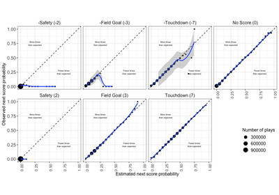
What we’ve done is referred to as LOSO (Leave-One-Season-Out) calibration. In well-calibrated models, the blue line in our plots will match (or, at the very least, be close to) the dotted line (where the estimated probabilities from the model match the observed/actual probabilities). We can evaluate the calibration of the model based on its calibration error — the closer it is to zero, the better:
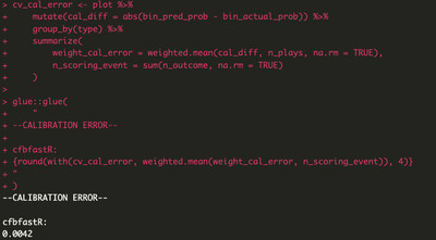
This is pretty good! For comparison, the NFL expected points model (made by people smarter than me and thus a personal gold standard) has a calibration error of 0.006.
But hold on: this extremely small error value doesn’t necessarily match what we see in our plots, especially in those of the opponent scoring outcomes where the blue lines are far off the dotted line. What’s going on?
Let’s unpack how we calculate calibration error:
- We tag our plays by rounding the estimated and actual probabilities for each play to the nearest 5%.
- We determine the difference between those two values.
- We calculate a weighted average using the plays that end in each next-score-in-half type and the aforementioned differences.
This final weighted average is our calibration error. Using a weighted average means that small sample sizes for a given next-score-in-half type don’t affect our overall calibration as much. There are only 2,680 plays where the next score is an opposing safety and 79,526 where the next score is an opponent field goal — while these number _seem_ large, within the context of our dataset (again, ~1.2M plays), they only account for ~7% of our data. Given that these plays are so rare, it’s hard for our computer to “learn” exactly what creates them, and so we end up with something strange-looking when we plot our results. But by that same token, this is such a small number of plays that we can trust that our model will get the vast majority of results right.
Now that we’ve verified that we can trust our model and its results, we can now get to #2: transforming its prediction results, which is actually fairly simple. As previously mentioned, our chosen modeling technique gives us a probability of each “next score in half” option happening, and we know what point values each of those options produces. We can combine both of those in a weighted average, otherwise known as an expected value, and given that these values are semantically in-game points, this final sum is our desired metric of “expected points”. Hooray!
But this is just a number. What does this actually mean? More importantly, how should I feel about a specific expected points value?
Let’s go back to Left Stadium and Right Field. We can now put a specific number (or series of numbers, if you use the probabilities) on the tension of those scenarios (examples pulled from our dataset):
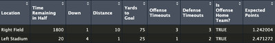
Given how these situations both felt, these values make sense, right? The computer is just reiterating what we already know and feel internally: The computer is just reiterating what we already know and _feel_ internally: one of these situations is far more stressful than the other because the offense has more (expected) points at stake. Put another way: your brain has built its own expected points model given your lived experience of the games you’ve watched; you just might not actively think about yard-lines and game situations in those terms.
Busy day! Let’s recap:
- We discussed the “why” of football analytics: no human can watch all of the games, but a computer can!
- You (yes, you — not me!) conceptualized, designed, built, and validated your own expected points model from soup to nuts, without having to learn advanced math or get into the weeds of complex machine learning techniques.
- We talked about how to go from an expected points value back to intuitive feelings and vibes.
Something we haven’t covered here is how to use expected points and EPA — we’ve done the hard part of explaining how to build the model, but not really given you a guide on how to apply it. There’s more coming on this later in the week, BUT for now, know this:
- EPA is calculated by taking the difference between the expected points values before and after a play, thus quantifying the effect of an individual play.
- You’ll typically see EPA used as EPA per play (IE: the average EPA generated across every play in a game or season). This value is a better version of similar team efficiency metrics like yards per play or per game (for reasons we’ll explain later). Higher is better.
If you want to read ahead and learn more:
- https://opensourcefootball.com/posts/2020-12-29-exploring-rolling-averages-of-epa/
- https://opensourcefootball.com/posts/2021-04-13-creating-a-model-from-scratch-using-xgboost-in-r/
- https://opensourcefootball.com/posts/2020-09-28-nflfastr-ep-wp-and-cp-models/
- https://cfbfastr.sportsdataverse.org/articles/index.html
- https://opensourcefootball.com/posts/2020-08-20-adjusting-epa-for-strenght-of-opponent/