
Teams make their own fate — or do they?
Hello, friends — welcome to Analytics Week. For five of our 100 Days to Kickoff, FTRS is bringing you college football analytics content, powered by our friends at cfbfastR and Statsbomb.
Yesterday, we worked through “how” and “why” to use expected points for analysis of offenses. To recap, our five key points:
- EPA is expected points added: the difference between the expected points values before and after a play, thus quantifying the effect of an individual play. A positive EPA for a single play means that the offense has increased its chances of scoring next in the half because of the outcome of that play.
- Because of how it’s derived, creating more EPA leads to more points and therefore more wins.
- Yards and EPA per game are good measures of offensive effectiveness, but are inherently affected by external factors that prevent analysis of an offense’s ability. We need to instead calculate metrics on a single unit of action to smooth these factors out: the play.
- Yards per play is a measure of offensive efficiency and a “truer” measure of offensive ability than yards per game or EPA per game. However, yards gained and lost aren’t actually equal at different parts of the field and in different situations, despite being treated as such here.
- EPA per play is a better/”truer” measure of offensive ability than yards per play because it accounts for differences in situational value while smoothing out differences caused by external factors.
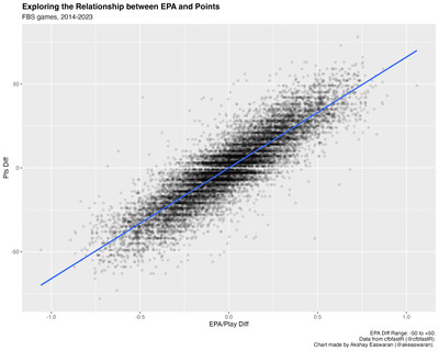
We couched our analysis in this idea that more expected points lead to more actual points, and indeed, we modeled this relationship two ways: on a per-game and per-play basis.
But what happens when you outgain your opponent in terms of EPA (either metric) and still lose? In our dataset (~7000 FBS vs FBS games from 2014 to 2023), there are 1011 teams (~14%) that lost games despite winning the total EPA battle, and 1024 teams (~15%) that lost despite winning the EPA/Play battle. These aren’t necessarily trivial parts of our dataset that we can ignore — how do we square these circles with the relationship we’ve established between EPA and points?
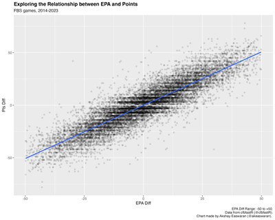
In truth, we’ve established that there is some relationship between these variables, but we haven’t exactly quantified it. Here’s that same per-game chart again with two annotations added:

Notice anything different? If you remember taking an intro to stats course, you might recognize R and R-squared above (don’t worry: no advanced proofs or actual math here, just words). We can measure the strength and direction of a modeled linear relationship using the value of R (the Pearson correlation coefficient) above. Here are some rules of thumb on how to interpret this value (from Scribbr):
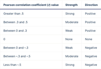
scribbr.com
Given an R value of 0.89, the data shows an extremely strong and positive linear relationship between EPA differential and point differential, quantifying what we see on our plot: all of the points form a thick mass that looks kind of like a thick textured line that flows up and right.
But saying a relationship is strong in a specific direction doesn’t account for the spread of the data; ideally, we’d like some metric to quantify how much of the spread the relationship accounts for. Enter R-squared: the simple square of R. In our example, R-squared represents the percent of the spread (or variation) in point differential that can be accounted for by EPA: 0.79 or 79%.
If teams with positive EPA metric differential always had positive point differentials, the relationship between point differential and EPA metrics within our dataset would have R- and R2-values of 1.0, meaning we wouldn’t really see a mass of black data points on the plots above. Instead, they’d all be lined up perfectly straight behind our blue line.
But that’s not how sports actually work. There’s always some space that keeps our model from delivering perfect predictions. Remember how we described the concept of “underlying numbers” yesterday:
[W]hile [underlying numbers themselves] are not explicitly points on a scoreboard or yards gained on a play, being good at accumulating them can help you generate those more explicit outcomes to succeed at your overarching goal: winning games.
If underlying numbers and points had a perfect relationship, then there would never be any need to use them to evaluate teams. Generating expected points is correlated to scoring actual points, but you still need to, you know, score the actual points. This space — this difference between expected and actual points — is what we might commonly call “luck”.
Let’s put this into a more intuitive context: if a team plays well but loses, we might call them “unlucky”. We might say, “they played well and fell just short. Play that game a hundred times and they’ll win 99 — just drew snake-eyes today”. On the flip-side: if a team plays poorly and wins the game, we might call them “lucky” (and, in some cases, very lucky), understanding that given their performance, the result was unlikely.
On Monday, we established that our brains have used our lived experiences to build an expected points model, but here they’ve also conjured up a relevant corollary: an expected wins model — that is, an internal barometer that a certain quality of performance will generally beget a certain result.
Whether via computer or via brain, we’re describing relationships between our underlying numbers, points, and wins in terms of what usually happens: on a universal timescale / in the big scheme of the universe /
If we therefore define “playing well” as accumulating more EPA than your opponent, we can be guided through the minefield of advanced stats by our own mental models: if a team wins the EPA battle but does not generate enough actual points and loses the game, we’d consider them unlucky. If a team loses the EPA battle but cobbles together enough actual points to win the game, we’d consider them lucky.
We can measure this “luck” by dropping the median step of analyzing EPA and point differential and directly evaluating the relationship between EPA and wins:

Much like with expected points, we can then put a probability to our intuition about a given performance:
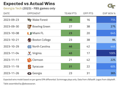
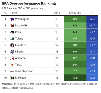
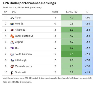
Then, we can sum up these probabilities to get an “expected wins” total. The difference between this value and the number of “actual wins” is our measure of “luck”. Teams with more actual wins than expected wins overperformed, while those with fewer actual wins than expected underperformed. In both cases: in the grand scheme of things, we expect that teams will post actual win totals in and around their expected wins totals. To put names to faces — err, examples to concepts — here are lists of the top 10 teams in terms of over- and under-performance from 2023:
As a final note, let’s look at the R- and R-squared values of the relationship between EPA differential and wins:
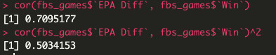
We see that while the relationship between EPA and wins remains strong and positive (R of 0.71), it’s a bit weaker than that of EPA and point differential. Additionally, while EPA differential explains 79% of the variance in point differential, it only explains 50% of the variance in wins — while this relationship is of similar strength, it’s far less explanatory; the other 50% of the variance in wins is left up to chance.
This is a lot of variance left to chance, but that doesn’t mean that the effort to model what helps teams win was in vain: there is a cottage industry around sport dedicated to recreating that remaining 50% (in some part) in the aggregate. We’ve quantified our mental model of wins very simply here, but privately-built (by teams or consultants) models (that are ostensibly far more complex) will be backed by a better understanding of what leads to wins and thus lower proportions of variance explained by chance (IE: luck). Mitigating the effects of luck allows you to streamline your process and optimize details: if you can go more directly from performance to wins, you can see the impact of changes in performance manifest as changes in wins. This is the whole point of analytics work: identifying what helps teams win more, evaluating those factors on the basis of how much more they help generate wins, and implementing changes in those factors to generate the most positive impact on winning.