
We’ve done the “What” — it’s time for the “Why” and “How”.
Hello, friends — welcome to Analytics Week. For five of our 100 Days to Kickoff, FTRS is bringing you college football analytics content, powered by our friends at cfbfastR and Statsbomb.
Yesterday, we unpacked the philosophy behind doing analytics work and built our very own expected points model, grounding everything in vibes rather than advanced math. As a soccer industry friend of mine once said on a podcast (paraphrasing): when teaching someone something we’ve found in the data, we’re not teaching them advanced math — we’re teaching them soccer. That’s the whole idea here: no human can watch all of the games, but a computer can — why not see what it can “learn” and see how we can use that to play better?
But something we didn’t really delve into is the “why” of expected points. Yes, we built a model, and yes, we understand how to interpret its results — but what does it all mean? What does it all build to? We’ve built a stone pile with a stick pyramid and found a way to light it, but what do we do next?
Let’s double back to the reasons we looked at expected points in the first place, specifically the last one:
If our end goal with the wide world of “analytics” is to figure out what helps teams win games, then it makes sense to look at the relationships between specific stats and wins.
Expected points and its related transformations are what we might call “underlying numbers” — that is: while they are not explicitly points on a scoreboard or yards gained on a play, being good at accumulating them can help you generate those more explicit outcomes to succeed at your overarching goal: winning games. This concept is beautifully (albeit somewhat implicitly) explained in Moneyball (every analytics staffer’s origin story):
With the help of Paul DePodesta (reimagined as Peter Brand for the movie), Billy Beane focuses on on-base percentage for player evaluation — why? From FanGraphs:
On-Base Percentage (OBP) measures the most important thing a batter can do at the plate: not make an out. Since a team only gets 27 outs per game, making outs at a high rate isn’t a good thing — that is, if a team wants to win. Players with high on-base percentages avoid making outs and reach base at a high rate, prolonging games and giving their team more opportunities to score.
Beane’s scouts are trying to optimize for runs batted in (RBI), which is certainly a measure of player ability but one that is heavily dependent on situational context (IE: that someone is in scoring position when a hit is made). On the other hand, OBP is more self-made — a player’s ability to get on base is more dependent on his own actions (err, reactions to pitches). Given that we know OBP gives teams more opportunities to score, it follows that getting on base more often leads to more runs. More runs obviously lead to more wins. Thus, rather than looking at an actual good outcome itself and taking it at face value (it’s very hard to argue that accumulating runs via RBI is inherently bad, cause, you know, they’re runs on the board), Beane is more interested in how to generate good outcomes more often with OBP.
Given how we’ve defined and proved out the concept of expected points, we’re doing much of the same analysis as Beane and DePodesta: consistently accumulating expected points (via expected points added, or EPA) means that the offense is moving from situations with lower chances of generating the next score in the half to situations with higher chances of generating said score. Generating the next score in the half (obviously) puts points on the board. Generating the next score in the half more often (by accumulating more EPA) leads to more points. Of course, more points leads to more wins, so we can draw this logical straight line from expected points to wins.
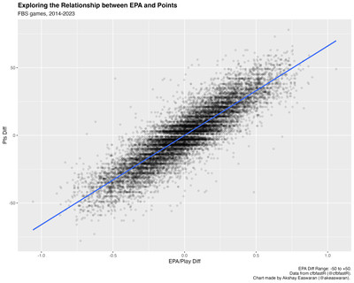
Obviously, we’d like to factcheck our logic against the data to make sure we’re on the right track. If what we’re saying is true — that teams that generate more EPA typically generate more points — then we would expect to see a strong positive correlation between EPA differential and point differential across our dataset (reminder: ~1.2M plays across ~7000 FBS vs FBS games across 10 full seasons of college football). Here’s what we get when we plot these two values:
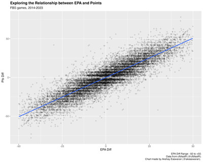
There is clearly evidence of a linear relationship here, and given how many games we’re evaluating this relationship across, we can say with some confidence that there’s merit to our logic.
If generating more expected points leads to more points (and therefore more wins), we’ll want to identify teams that are very good at generating expected points in a single game. Going a step further, we might say these teams are “effective” at achieving their goals. Traditionally, we’d evaluate effective offenses using yards per game; in keeping with that same theme, let’s rank the top and bottom 10 teams from the 2023 season using EPA per game:
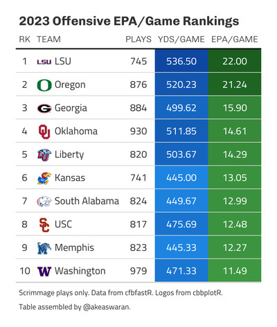
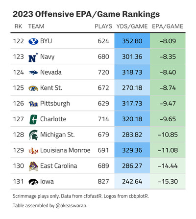
This makes sense as a simple barometer of “good” versus “bad” offenses: much like with yards per game, we’re capturing high output offenses, and generally high output offenses are “good” offenses.
But critically, like with yards per game, we’re also capturing high opportunity offenses (as you can see from the number of plays per game), whether by opponent tempo, turnovers, or 3:30 CBS kickoffs turning into four-hour games. These factors are like needing runners on base to generate an RBI: while you can use EPA per game and yards per game to describe an offense’s performance in a single game, the external factors (to the offense) built into them cloud their measurement of an offense’s “true” ability.
We need to find our version of baseball’s plate appearance — a single unit of action in which the offense controls their performance — to smooth out these sorts of confounding factors. With this unit in hand, we can measure offensive performance like OBP: how effective was an offense at generating positive outcomes when accounting for their opportunities?
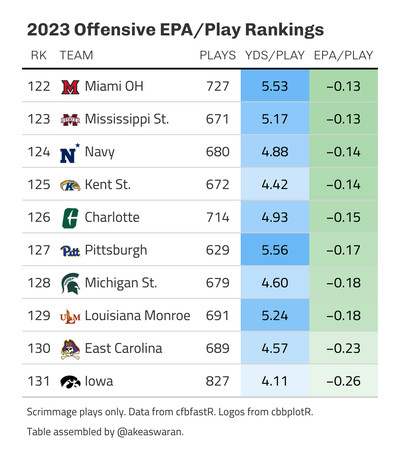
The obvious candidate unit here is the play, and the efficiency metrics that follow logically are therefore yards and EPA per play. Let’s re-rank the top and bottom 10 offenses from 2023 with this in mind:
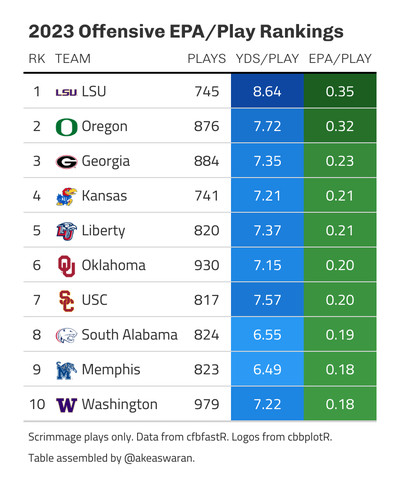
And does our truism about EPA differential and point differential still hold true here if we use EPA per play differential instead?
It sure does!
If you’ve read closely, you might have noticed we set aside yards per play in our analysis — why? Hint: it has to do with a lot of the stuff we talked about yesterday. Take a few minutes to read through that piece again.
Let’s key in on this part from yesterday:
[I]n different situations, we feel different ways based on if we think someone is going to score soon. The concept of expected points is just a method of quantifying that feeling.
In the context of yards per play, every yard gained is equal — a yard is a yard is a yard. But deep down inside, we know there’s some inherent value to each combination of situational factors (yard-line, down, distance, etc) for a single play, and we know that value can change from down to down, yard-line to yard-line, etc. Thus, the yards gained or lost on a play are not truly equal units.
Using the expected points gained and lost (IE: EPA) helps us account for that unit inequality. An offense with high EPA per play is effective on a per-play basis, even when factoring in the situational context of each play: it is generating outcomes that increase its chances of scoring next in the half by a significant margin. In other words (well, word), this example offense is efficient at taking advantage of its opportunities, and if we go all the way back to our logic about expected points and wins:
- If you create more expected points, you increase your odds of scoring next in the half.
- If you create more expected points more often (IE: you are efficient at creating expected points), you will increase your odds of scoring next in the half more often.
- Scoring next in the half more often (IE: scoring more often) leads to more points.
- More points lead to more wins.
If you only take away five things from this post about expected points, EPA, and how to use them, here’s what you need to know:
- EPA is expected points added: the difference between the expected points values before and after a play, thus quantifying the effect of an individual play. A positive EPA for a single play means that the offense has increased its chances of scoring next in the half because of the outcome of that play.
- Because of how it’s derived, creating more EPA leads to more points and therefore more wins.
- Yards and EPA per game are good measures of offensive effectiveness, but are inherently affected by external factors that prevent analysis of an offense’s ability. We need to instead calculate metrics on a single unit of action to smooth these factors out: the play.
- Yards per play is a measure of offensive efficiency and a “truer” measure of offensive ability than yards per game or EPA per game. However, yards gained and lost aren’t actually equal at different parts of the field and in different situations, despite being treated as such here.
- EPA per play is a better/”truer” measure of offensive ability than yards per play because it accounts for differences in situational value while smoothing out differences caused by external factors.
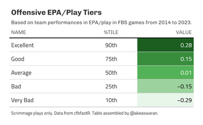
As a parting gift, here are some rules of thumb for EPA per play when you’re following CFB games online (hopefully via Game on Paper?):
Back tomorrow with more!